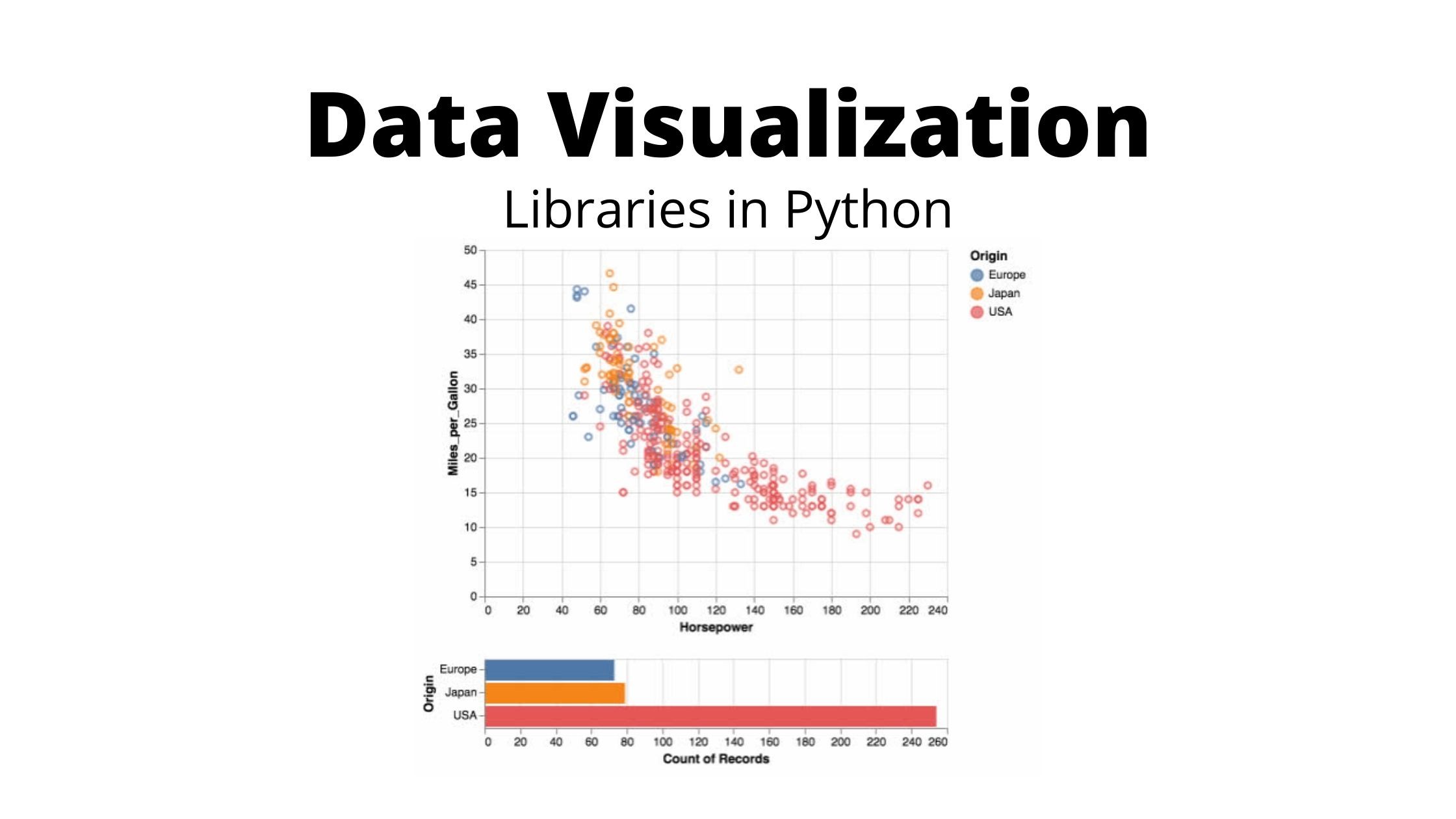
Basic Data Visualization in Python
Data Science Tutorial
Data Science Tutorial: A Guide to Data Visualization in Python
Do you want to take your data science skills to the next level? Then it’s time to learn how to do data visualizations in python! Data visualization is an incredibly powerful tool that allows you to explore, understand, and communicate data in ways that are both visually appealing and easy to understand. In this tutorial, we’ll be taking a deep dive into the world of data visualization in python and showing you how you can get started creating beautiful and meaningful visualizations.
First, let’s start by discussing the importance of data visualization in data science. Data visualization is an essential part of the data science process, as it allows you to quickly identify patterns and relationships in your data that might not be immediately apparent from just looking at raw data. Data visualizations can also help you communicate your findings to others in a way that is both compelling and easy to understand.
Now, let’s get started with the tutorial! To get started, you’ll need to have python installed on your computer. If you don’t already have python, you can download it for free from the python website. Once you have python installed, you’ll need to install the following libraries:
Matplotlib:
This is a powerful library that provides a wide range of data visualization tools and techniques, including line graphs, bar charts, histograms, scatter plots, and much more.
Seaborn:
This is another popular library for data visualization that provides a more modern and sophisticated set of visualizations that are specifically designed for data science.
Pandas:
This is a powerful library for data analysis that provides easy-to-use data structures and data analysis tools for working with data in python.
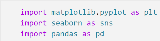
With these libraries installed, you’re ready to start creating beautiful data visualizations in python! To get started, let’s start by importing the libraries into our python script:
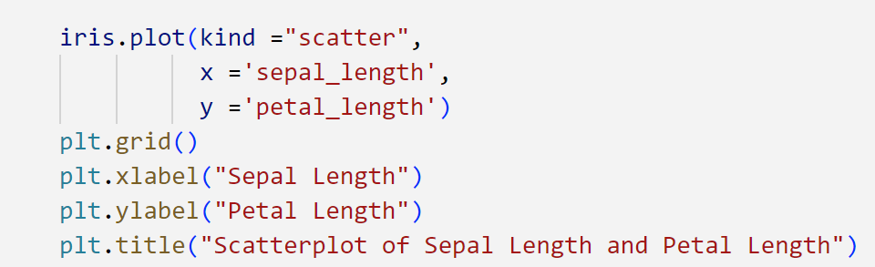
Next, let’s load some data into our python script. For this example, we’ll be using the Iris dataset. You can load it into python using the following code:

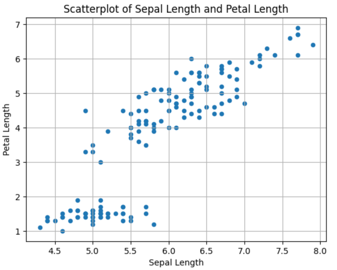
With our data loaded, we’re now ready to start creating data visualizations! To get started, let’s create a simple scatterplot that plots sepal length and petal length. To do this, we’ll use the following code:
This code will create a simple line graph that shows the total sales of cars over time. You can see that data visualization is incredibly simple in python, and that you can quickly create beautiful and meaningful visualizations with just a few lines of code.
Now that you know the basics of data visualization in python, it’s time to take your skills to the next level! There are many other libraries and techniques available for data visualization in python, and I encourage you to explore them further. With the right tools and techniques, you can create truly stunning and informative data visualizations that will help you communicate your data insights to others.