
Golf Earnings Project- Part 2: EDA
Overview of exploratory data analysis steps for Golf Earnings Data Project.
Introduction
As explained in the Part 1: Data Collection blog before this, professional golfers are able to make more money on the PGA Tour than ever before. A golfer’s season earnings are dependent on their success– win more (of the more popular tournaments) and make more money.
I want to see what factors contirbute most to golfers winning the most money during a season. Is it their driving ability? Or is it more about putting? I will look at the top 50 golfers for the past 5 complete years of the PGA Tour to see how somebody can win the most money.
For this project, I used PGA Tour data available from ESPN. In the last post, I explained how I scraped the data from ESPN to create the data for the top 50 golfers each year on the PGA Tour for the last 5 full years.
In this post, I will do some exploratory data analysis on the data we collected.
The complete code and data can be found in the following Github repo: https://github.com/cambutler33/Golf_Earnings
Initial Steps
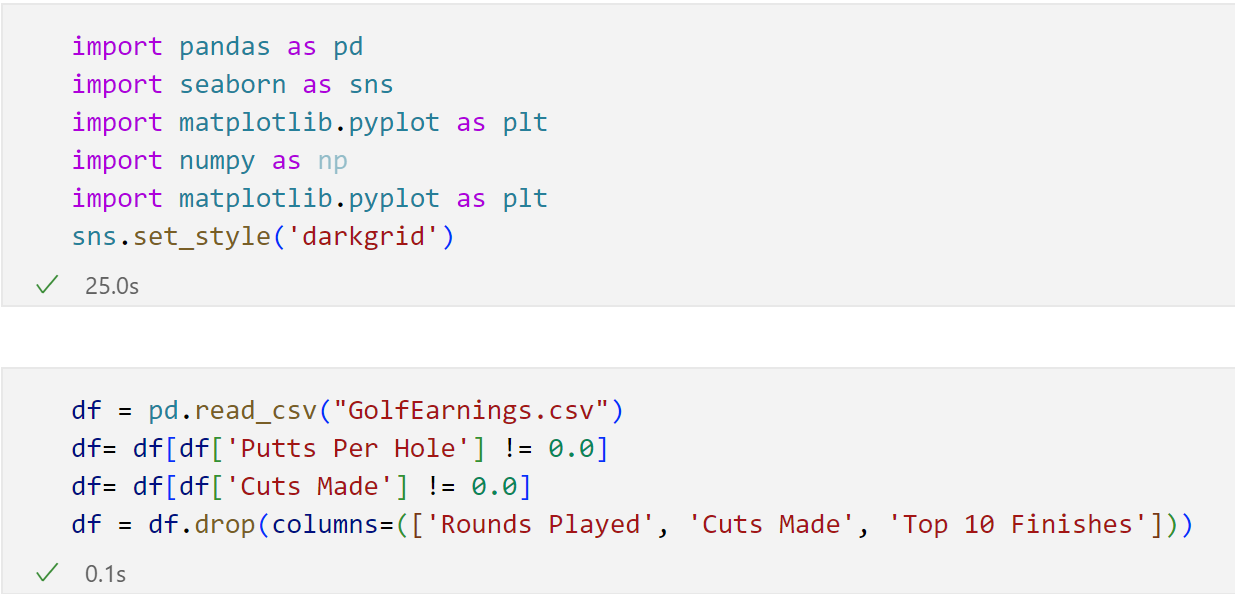
First, I cleaned up the data just a little bit more by removing false rows and removing columns that we do not want to analyze at this time. We also import all of the packages that we need to do our EDA.
Exploring the Dataset
Next, we will call certain functions to explore our dataset and get an idea of what we’re working with. These steps are also done to ensure that our data is ready to go to perform analysis.
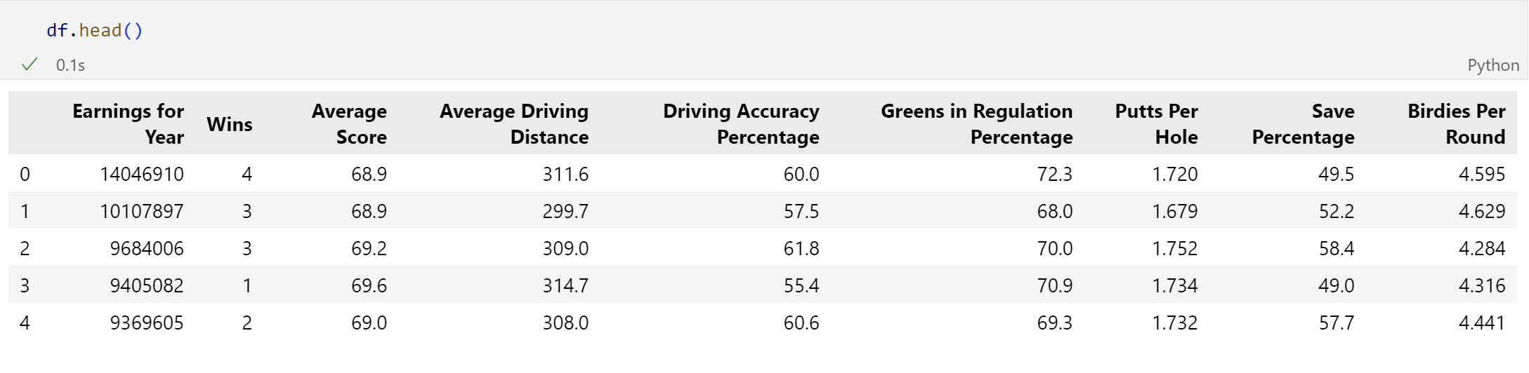
First, we will call df.head(). This allows us to see the first few rows of data.
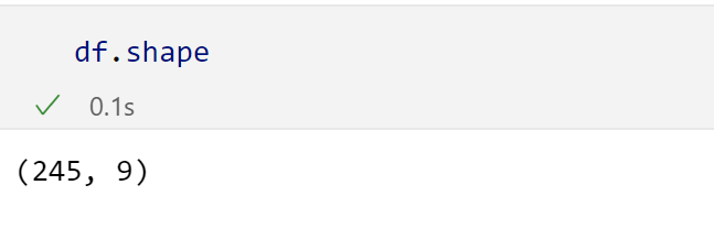
Next, we will call df.shape. This returns a tuple with the number of rows and columns in the dataset. Note that we went from 250 rows to 245 since there were 5 rows of bad data that we dropped earlier.
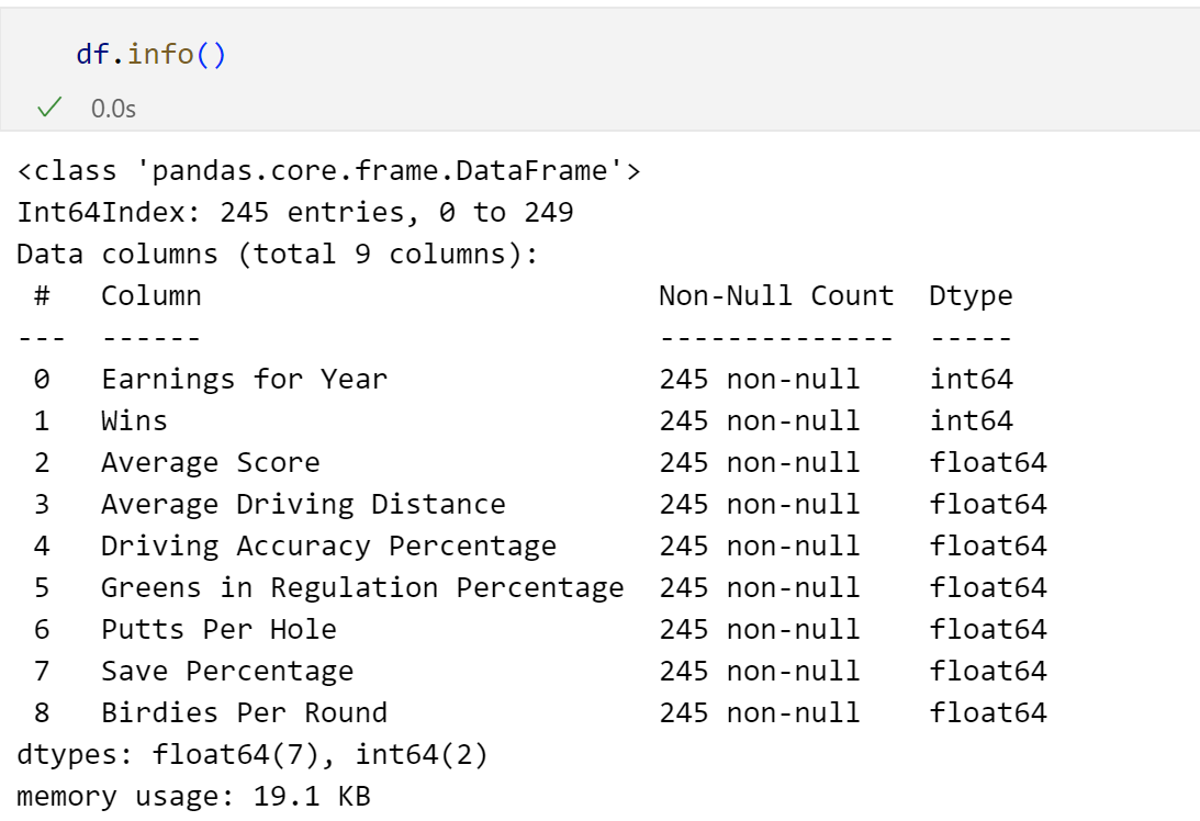
Next, we will look at df.info(). This returns to us how many non-null rows there are in each column, and the data type of each column. This is extremely helpful since we need to make sure that our datatypes are what we expect. As we can see, all of our datatypes are how we want them.
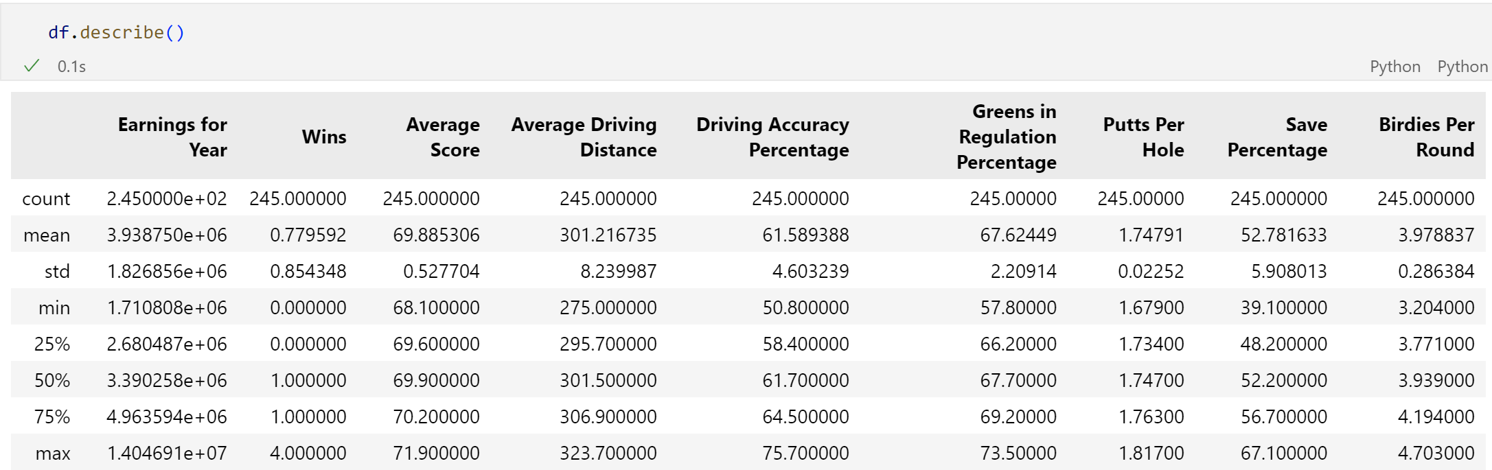
Lastly, we call df.describe(). This is a great function to call in order to return basic summary statistics in a neat/organized table showing each variable.
Boxplots and Analyses
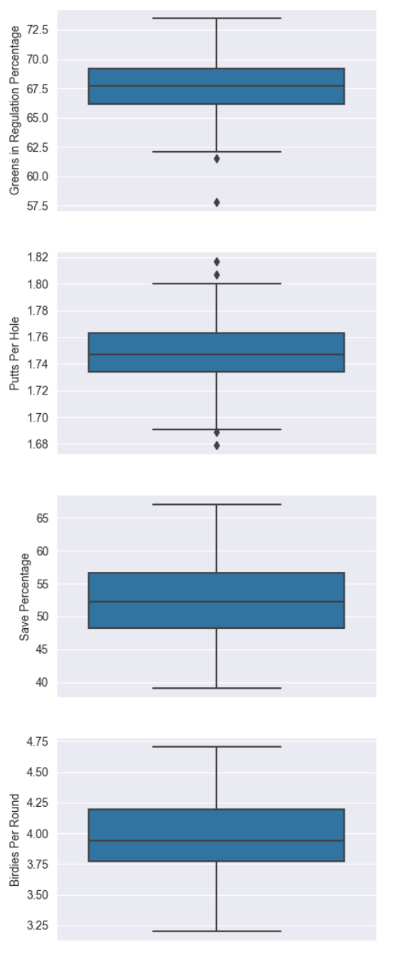
The following code was used to create a boxplot for each of the independent variables we want to track in this analysis.
fig, axes = plt.subplots(8, 1, figsize=(5, 30))

sns.boxplot(ax=axes[0], data=df, y='Wins')
sns.boxplot(ax=axes[1], data=df, y='Average Score')
sns.boxplot(ax=axes[2], data=df, y='Average Driving Distance')
sns.boxplot(ax=axes[3], data=df, y='Driving Accuracy Percentage')
sns.boxplot(ax=axes[4], data=df, y='Greens in Regulation Percentage')
sns.boxplot(ax=axes[5], data=df, y='Putts Per Hole')
sns.boxplot(ax=axes[6], data=df, y='Save Percentage')
sns.boxplot(ax=axes[7], data=df, y='Birdies Per Round');
Now let’s look at these boxplots.
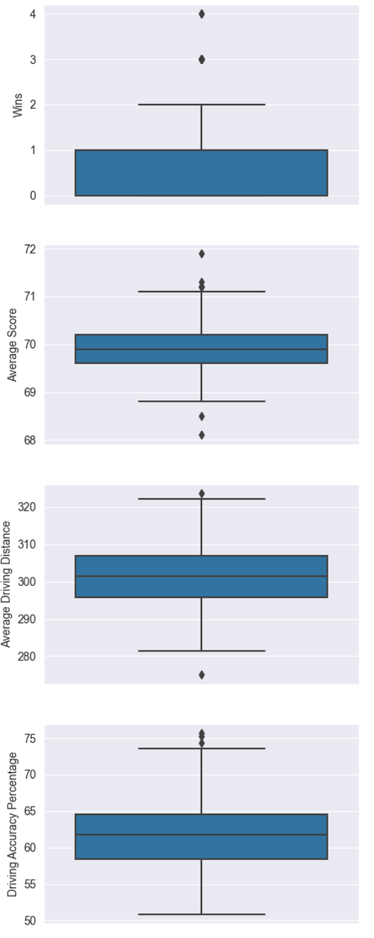
What stands out the most to me in the boxplots is that the golfer with the most wins in a year had 4 wins, and that was an outlier. Even just 1 win can separate golfers by a huge margin on the PGA Tour.
Also, the golfer in this dataset with the highest average score (and this was even an outlier!!) had an average score of 71 per round. This is still 1 under par! That is a little discouraging for the average golfer like myself that a ‘bad’ golfer in this dataset still shoots under par.
These boxplots are extremely helpful for us to see spreads and outliers among all of our independent variables and help us a get a better feel for the data.
Correlation Matrix
Here, I created a correlation matrix heatmap showing the correlation between each variable.
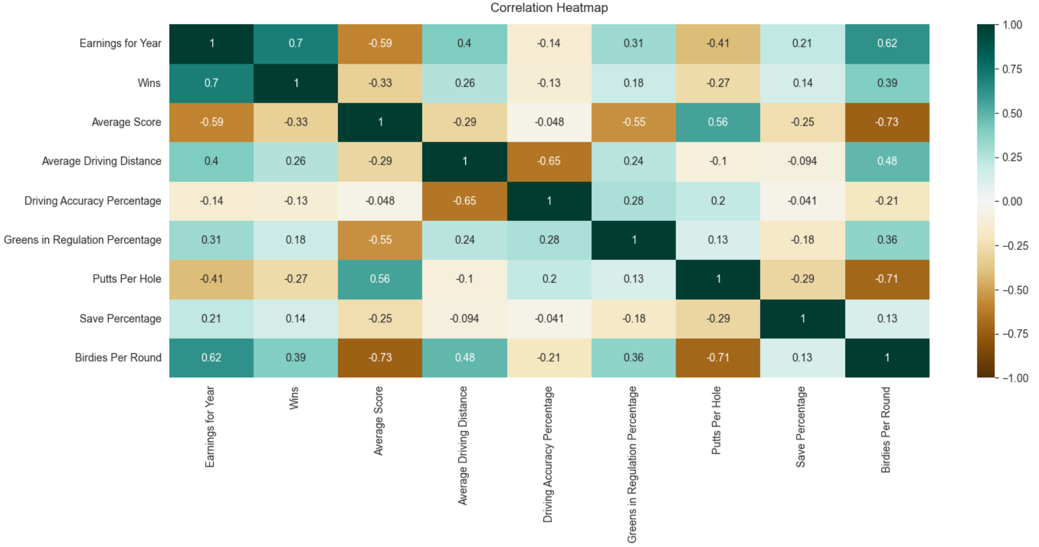
Notice that both average score and putts per hole have a negative correlation for earnings for year. This makes sense, have a lower score and putt less and you’ll most likely make more money since those are good attributes for golf. However, it is shocking to see that driving accuracy has a negative correlation with earnings per year. This means that driving accuracy does not play a huge part in distinguishing golfers who make more money and those who don’t make very much.
Besides wins, the variable that has the highest correlation with earnings per year is birdies per round. For those who don’t know, a birdie is when you shoot 1-under par on a given hole. In other words, that is a good hole and golfers want the most birdies (or better) as possible. If you can consistently get birdies, you have a shot at making some good bucks throughout the year. You don’t have to drive the ball the furthest, you just have to get it on the green and make birdies.
The code for how to create the heatmap is contained in the GitHub repo.
Conclusion
To wrap up, we narrowed it down to birdies as what may help golfers make the most money in a year on the PGA Tour over other attributes such as average driving distance.
In the next post, I will wrap up this project and conclude with all of my findings. Thanks for reading! Stay tuned!